EMILY HOLT ILLUSTRATION


Sunday, November 16, 2014

New York Contact Period

I've just returned from an exhilarating trip to New York city with my Hartford MFA group. As Doctor Seuss might say "Oh the places you'll go!", and we certainly went and saw so many great places, and people, that my head is still spinning (in a good way). Throughout the week, we had a line up of incredible guest illustration speakers:

1. Rudy Gutierrez: http://www.rudygutierrez.net/
2. Barbara Nessim: http://www.barbaranessim.com/
3. Donato Giancola: http://www.donatoart.com/
4. Steve Brodner: http://stevebrodner.com/ 
5. Joe Ciardiello: http://www.joeciardiello.com/
6. Yuko Shimizu: http://yukoart.com/
7. Burt Silverman: http://www.burtonsilverman.com/
8. Peter de Seve: http://www.peterdeseve.com/

This took place at The Society of Illustrators http://www.societyillustrators.org/. It was my first time visiting. Never have I wanted so badly to simply set up house in a museum.


Happy illustrators discussing illustration at The Society of Illustrators.


 It was a surreal moment to come face to face with the original of one of my favorite book covers (Sabriel by Garth Nix) from a special display of Leo and Diane Dillon's work http://www.societyillustrators.org/The-Museum/2014/Leo-and-Diane-Dillon/The-Art-of-Leo-and-Diane-Dillon.aspx. 

"Sabriel" cover art by Leo and Diane Dillon


 We held our first critique for our finished magazine cover projects, at The Society as well. As Murray and Carol Tinkelman were unable to attend this time around, we had a successful Skype session with them during the critiques.

 
Our magazine projects are lined around the bottom.

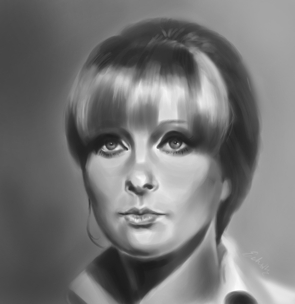
My finished cover piece of Maria Callas inspired by Coby Whitmore's style:


On another day, we toured the beautiful Pratt Institute campus,


 and the stunning home of collaborative children's book couple, Ted and Betsy Lewin, where we also received a lighting and reference photo workshop with Bill Kontzias:


Ted Lewin's watercolors up in his studio


Some lighting exploration


 There was a lively evening drawing session with Ted Michalowski http://tedmichalowski.com/ at the Society as well.

How cool is it to watch yourself materialize on paper, within a few moments? Very cool! (drawing by Ted Michalowski) 


I also got to see the gorgeous Cloisters with a family member. The Unicorn Tapestries were unforgettable http://www.metmuseum.org/visit/visit-the-cloisters


On the final day, our bedazzled class walked into the Illustration House, a rare gallery and auction house for originals of famous illustrators. http://illustrationhouses.com/, and saw work hanging on the wall, which is featured in our Illustration History book: The Illustrator in America (1860-2000). We had the privilege of meeting editor of the book himself, Roger Reed (president of Illustration House). It was exciting to see how staunchly this gallery has worked to keep this illustration documented and available to view and purchase, but a little sobering to hear undervalued illustration has been in comparison to fine art over time. It is mind boggling how anyone could look at work like this...


...and not see it as every bit important, worthy of praise, and influential as the work of fine painters.

It's easy to take for granted what surrounds us daily, and the rich history of the profession. I would encourage anyone to visit The Society of Illustrators and The Illustration House to see the unique beauty illustration brings to our lives, and to be inspired anew by the incoming artists.

Monday, October 13, 2014

October Updates

After getting back from the July summer session at Hartford, and completing some papers, I've been working on an exciting assignment: Create a cover for a particular magazine, of specific decade, in the style of an illustrator from that time period.

I'm painting Maria Callas on the Saturday Evening Post (50s) in the style of Coby Whitmore.  Before even getting started on the final, I spent a pretty long time on process. Here are just a few of the thumbnails and value studies


Interestingly, the final piece I'm working on has evolved dramatically from any of the compositions I initially came up with.


Wednesday, June 25, 2014

Getting ready for grad school

Haven't been posting much lately, as I'm preparing and trying to come up with good project concepts for my first term at the Low Residency Master's in Illustration program at Hartford University, for which I'm very excited! It looks like it's going to be an intense but wonderful journey :)

Sunday, June 8, 2014

Terrain of Shade

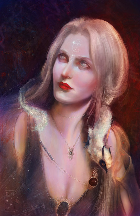
Sneak peek of upcoming Nightmare Illustrated drawings for Jordan Elizabeth Mierek's "Terrain of Shade"


For more about Nightmare Illustrated, visit their blog: http://nightmareillustrated.blogspot.com


Friday, April 4, 2014

Nelson Mandela Commission

I was recently commissioned on Dreamup to create an illustration of Nelson Mandela's inspiring quote, "Education is the most powerful weapon which you can use to change the world." I enjoyed the process for this challenging and broad concept quite a bit.

I began with some crude thumbnails where I explored ideas :

--I thought of an archer shooting an arrow of education at the Earth, and educational items sprouting up. This didn't seem to fit, and raised the question of gender, and god figures.

-The idea of a weapon of education cutting into the earth, and again something positive coming out, but this had the connotation of division.

-An hourglass with the Earth in the center, and educational things pouring on, and negative things pouring out. The biggest problem here was that the hourglass would run out.

The best idea involved hands surrounding the Earth, and participating in educational activities to better and enrich it. There could be one hand stopping another holding a knife, while yet another offers a book as an alternative to violence. Still another hand would be planting a sprouting seed of knowledge or education. The hands could be different colors to emphasize multicultural backgrounds.

 I began to play around with where I might fit the typography:


Basic linework


The typography was getting a bit lost so to increase emphasis on the quote, I worked it out some more


Once the linework was refined using pens, sharpies, and some digital touch ups, and approved by the client, I moved on to coloring digitally and adding in textures. A decision was made from a selection of schemes.


The last step was final touch ups, tightening linework, and places where colors got a bit sloppy for a final refined look.